
Two Subways
The MTA publishes every delay, every rider, every elevator. Spend a weekend with the data and a different city emerges - one where the same fare buys two very different subway systems.
- 21.7%
- Peak B-train riders 5+ min late
- 65.2%
- Bronx 2025 ridership vs 2019
- 28%
- Stations fully ADA-accessible
- 185k
- Missing Bronx weekday trips / day
Ride the New York subway long enough and you develop opinions about which lines are cursed. Most of those opinions are right.
Same fare. Same map. Two systems.
The MTA's “Customer Journey-Focused Metrics” dataset measures perhaps the most important rider outcome: what share of riders, at rush hour, arrived more than five minutes late? Over the twelve months ending April 2026, the answer for the B was 21.7%. The Q was 21.4%. The D, 19.5%. The M, 19.3%.
Two riders each pay $2.90. One has a 9% chance of arriving five minutes late. The other has a 22% chance.
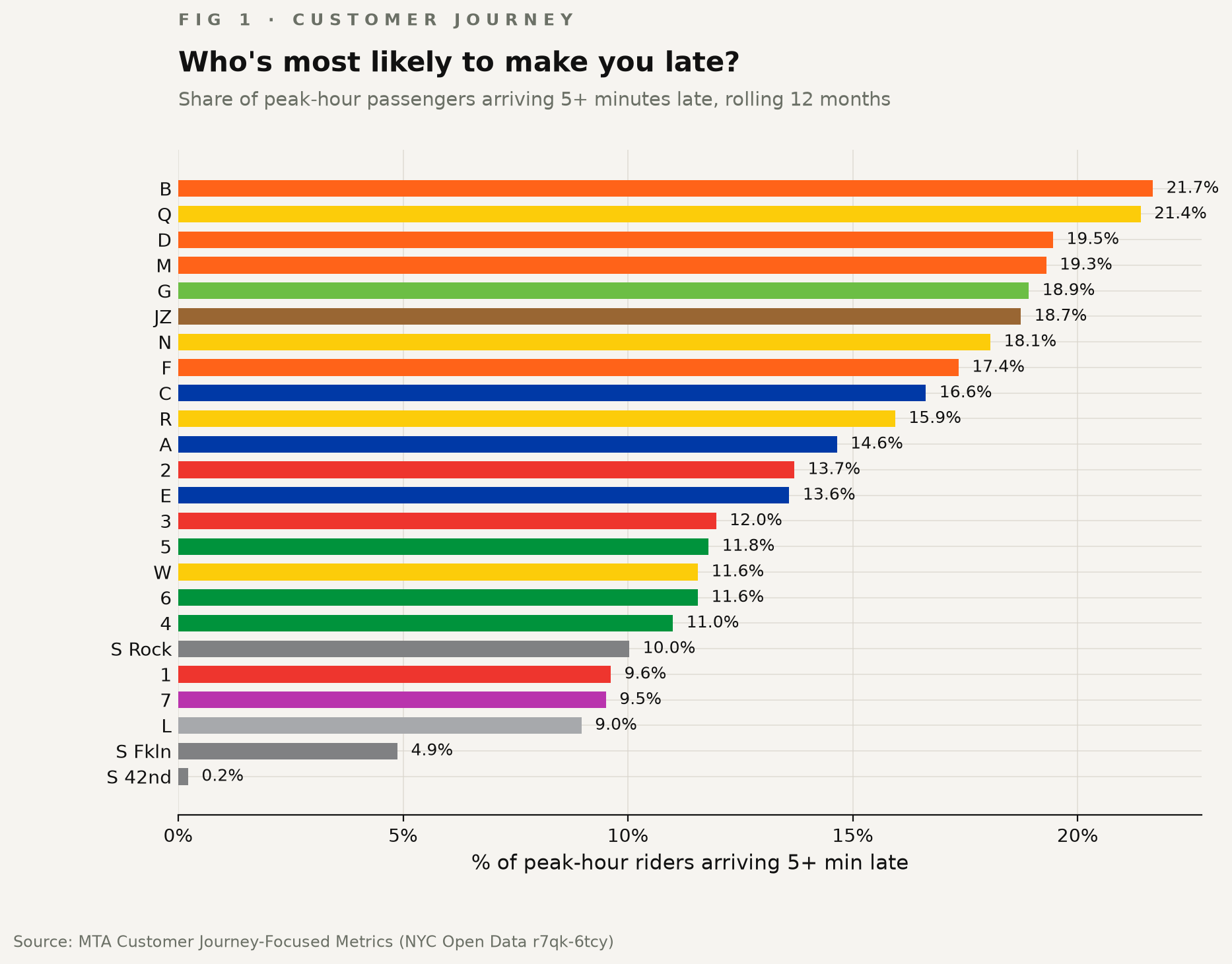
One in five riders on the B arrives more than five minutes late during rush hour. On the L, it's fewer than one in ten. Two riders paying the same fare can have dramatically different experiences depending on which platform they stand on.
The worst lines have lagged the system for a decade
The four worst-performing lines for delayed peak journeys — B, Q, D, M — all share BMT infrastructure through Brooklyn, running on signals built when Coolidge was president. The best performers — L and 7 — both have CBTC signaling installed.
This isn't an anomaly. It's a ten-year trend.
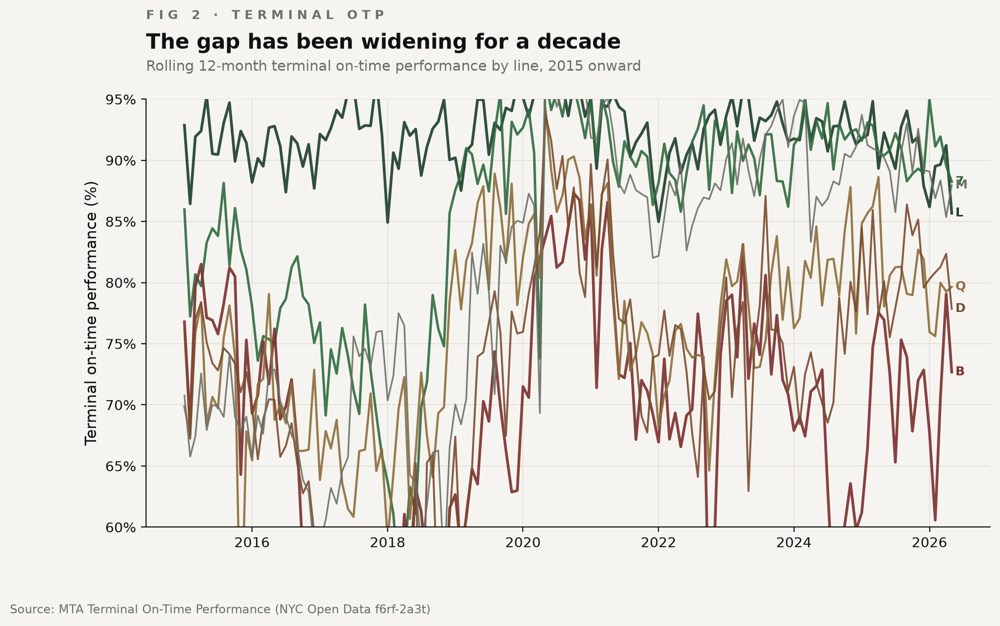
The timing strongly coincides with CBTC rollout - the L's improvement arrives in the months immediately following full installation. The 7 followed. Every other major line still relies primarily on legacy relay-based signaling.
Aging steel is most of the story
When the MTA classifies the cause of each delayed train, one category swallows almost everything else.
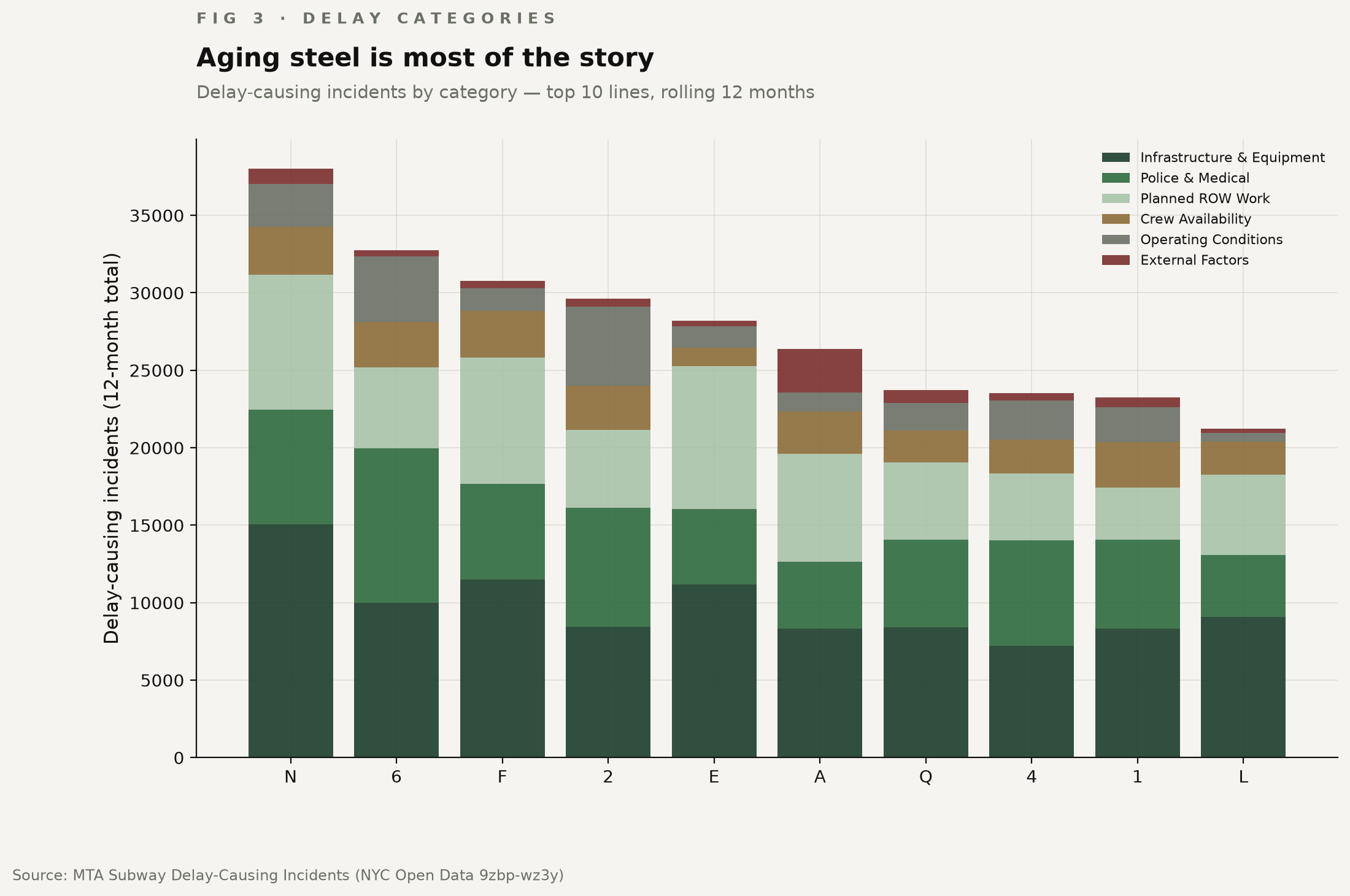
“Infrastructure & Equipment” — track, signals, power, rolling stock — accounts for more than a third of every line's delay ledger. “Planned ROW Work” — i.e., announced track shutdowns — adds another fifth. Together they explain more than half the delays on every line. Crew availability is near the bottom.
The story New Yorkers tell themselves about delays (operator error, sick passengers, people on the tracks) is at most a third of the actual ledger. The dominant cause is the same one the MTA's last four capital plans have asked Albany to fund.
Every borough recovered. Except the Bronx, which is stuck at 65.2% of its 2019 ridership.
Where the riders actually are
The borough story is where the data gets unfair.
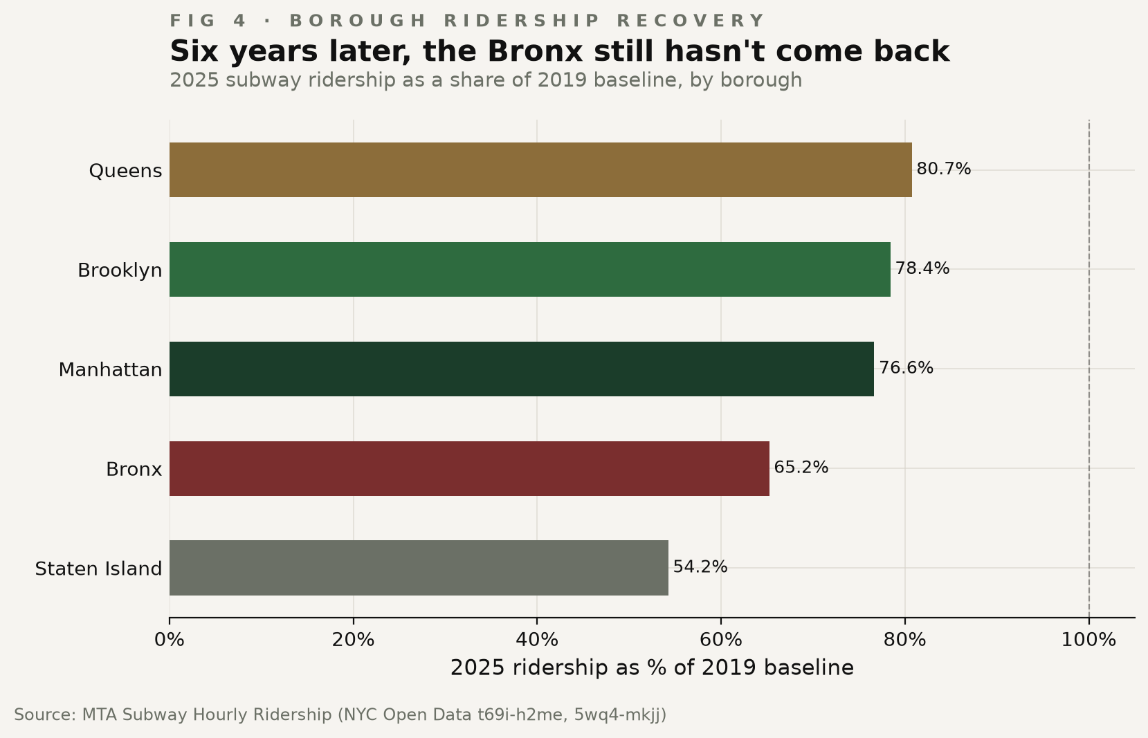
Six years after the pandemic, every other borough is now in the 76-81% range — still well below 2019, but trending up. The Bronx is stuck at 65.2%.
That's not a small gap. The Bronx in 2025 lost 1.4 percentage points of its share of the entire subway system - a borough that was already only 8% of ridership is now under 7%. 48 million fewer annual trips than 2019, or roughly 185,000 missing weekday trips a day. The recovery elsewhere wasn't enough to offset the Bronx's losses.
Manhattan rides home. The Bronx rides to work.
The hourly ridership data tells you who the system is for. And who it serves most effectively.
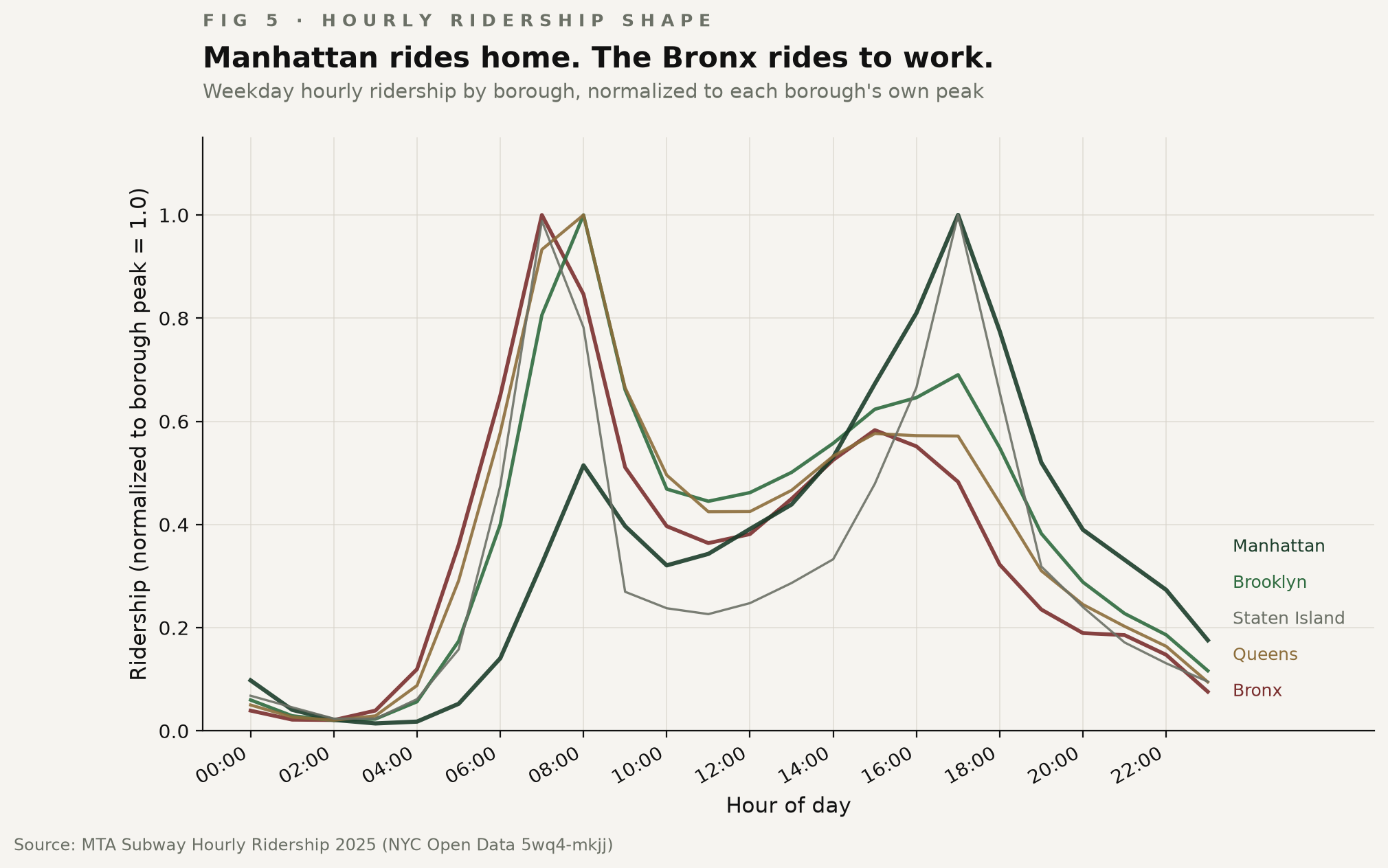
Manhattan ridership peaks at 5pm - the homebound commute, for people who work in Manhattan, not who live there. Brooklyn and Queens peak around 8am. The Bronx peaks at 7am — the shift-worker hour.
When the B and the Q underperform on the morning peak, the riders who absorb it are the ones leaving the Bronx and outer Brooklyn at 6am to make a 7am shift in a Midtown lobby or a hospital basement.
Two out of three stations have no elevator
Of the city's 445 station complexes, only 123 are fully ADA-accessible - 28%. The rest you climb.
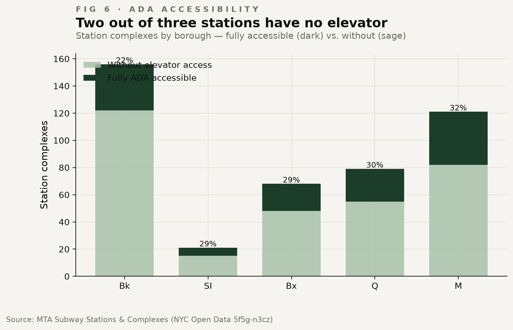
The pattern is difficult to defend. Manhattan, the borough with the deepest pockets and the densest stations, is also the most accessible at 41%. Brooklyn - the second-largest ridership borough - is the worst at 22%. Of Brooklyn's 156 stations, 122 have no elevator.
For many wheelchair users, crossing Brooklyn often means relying on Access-A-Ride instead, where the average wait is over an hour and on-time performance is unmeasured.
And it isn't just the small stations. The fifteen busiest stations in the entire system without full elevator access carried 148 million riders in 2025 - combined, that's more than every Bronx station put together (90M).
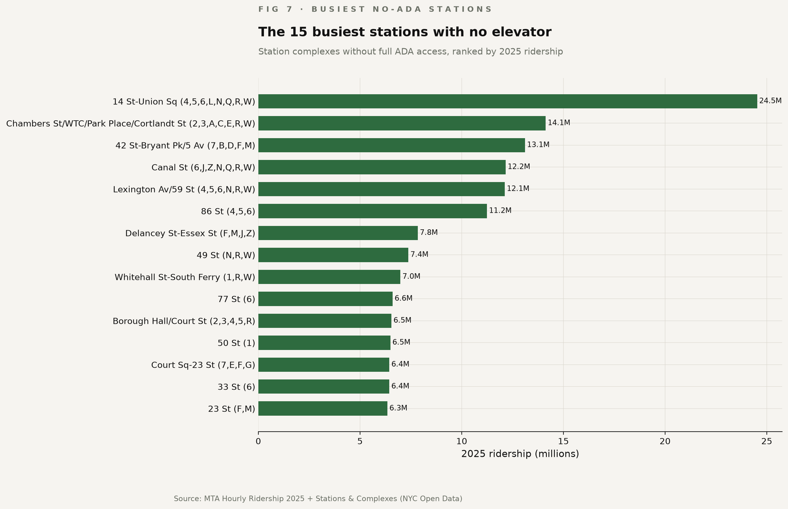
14 St-Union Sq (4,5,6,L,N,Q,R,W) alone moved 24.5 million people - more than the four busiest Bronx stations combined. The MTA opened one elevator at the northeast corner in 2025. One entrance, out of many.
Same fare. Different subway.
The system isn't one system
The MTA frames its performance reports as system-wide percentages. About 80% of trains on time. About 28% of stations with elevators. Aggregate numbers.
But the system isn't one system. The 7 and the B share nothing but the fare. The Bronx in 2025 isn't the Bronx in 2019. A wheelchair user in Brooklyn isn't a subway rider at all.
The map shows one subway. The data shows two.